
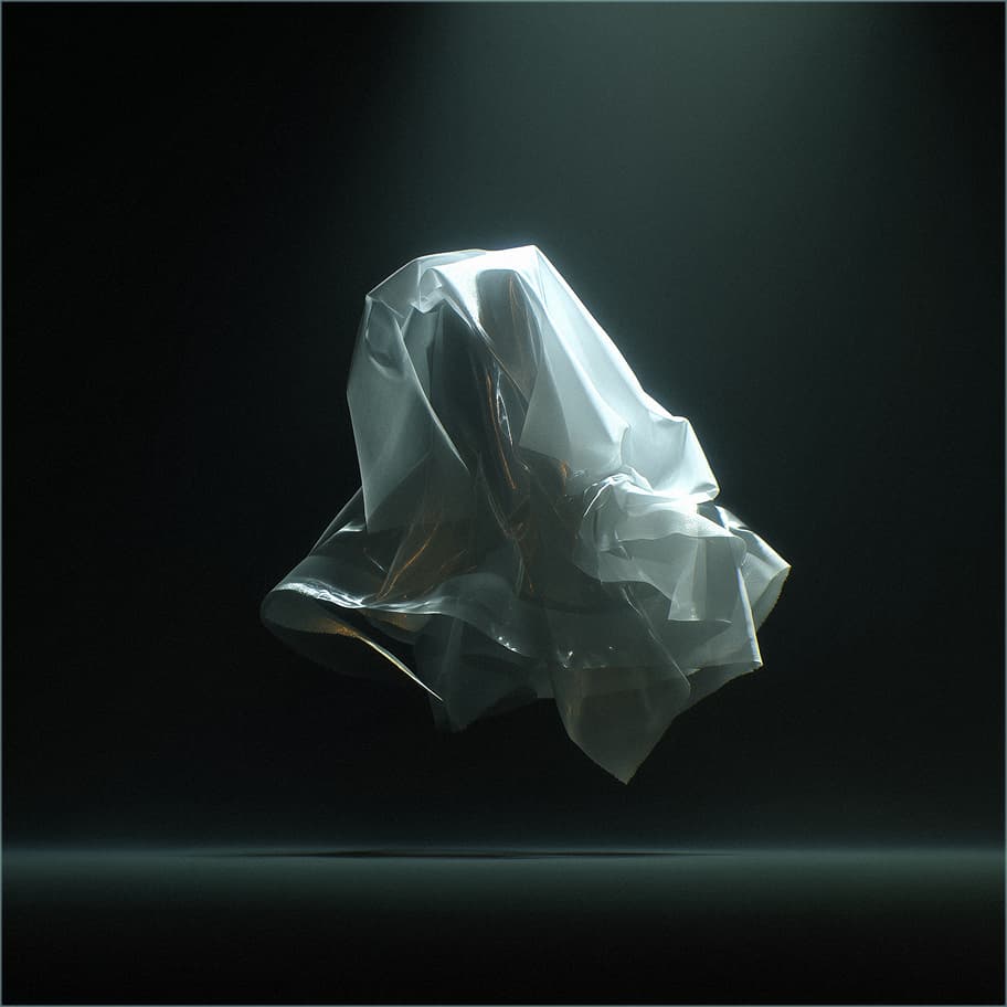
[ UX/UI & PRODUCT & GRAPHIC ] DESIGNER
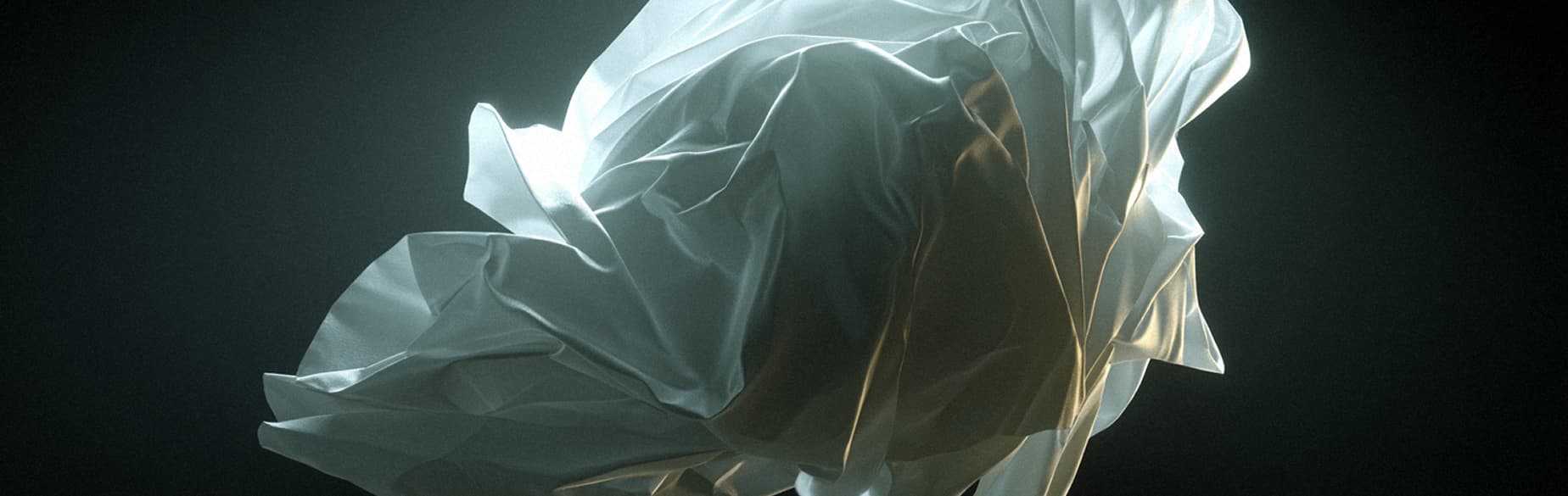
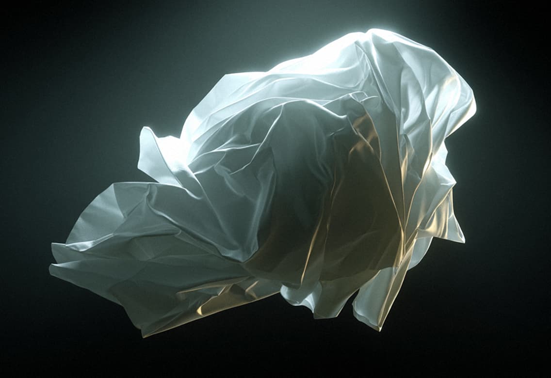
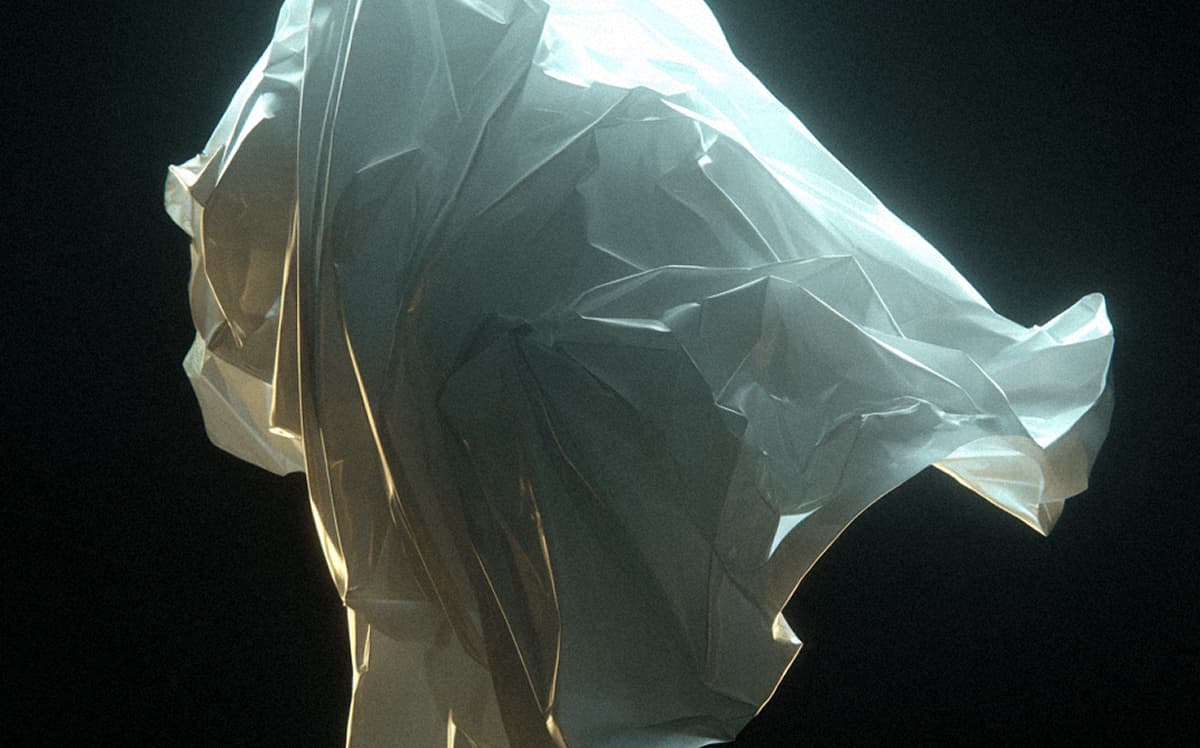
Hello! I'm 
Hello! I'm
Hello! I'm
And there's not a single word on this website written by chat GPT. Amazing, right?
About me
[ CONTACT ME ]

Something 
Something
Something
I’m a UI/UX and graphic designer. I’m from sunny city Odesa, Ukraine. I usually work on unique projects — you’ll be able to see them later in my portfolio.
I’ve been into creativity since childhood (drawing, clothing painting, later tattoos, design), so I proudly claim that when it comes to visual language, I’m a native speaker!
My approach to design is conceptual. I genuinely believe that even working on the simplest task can be turned into a small adventure if you infuse some meaning into it.

About my 
About my
About my
Most likely, you’ve either never heard of conceptual design or, maybe, you’ve only heard of the term.
For those who are not into design and marketing, it may seem at first glance just like a new trend, a "hipster" movement adapted for ads or websites, something like the overused "mindfulness" trend.
In reality, conceptual design surrounds you every day. Do you think Apple would have achieved such success if they tried to sell their product to you directly? Agree, probably not. Because Apple, first and foremost, is not iPhones, Apple is a six-inch symbol of your personal success.
No matter how some people try to prove to others that iPhones are worse than Androids, this argument is inherently doomed to fail.
Yes, maybe iPhones are worse than Androids, but that fact doesn’t discredit Apple in any way — it has been the richest company in the world, and likely will remain so for a long time. Because Apple is not a product. Apple is a philosophy.
Admit it, having such confidence from people in your product, even if it’s not perfect, or, moreover, mediocre — is a very comforting safety net for your business, isn't it? This is the effect conceptual design creates!
Let me demonstrate more clearly.
What do you think, which option looks better?
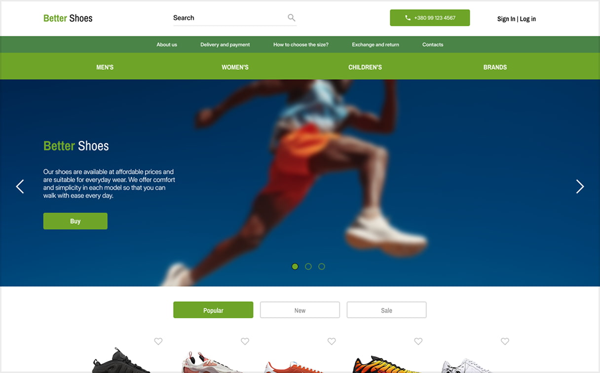
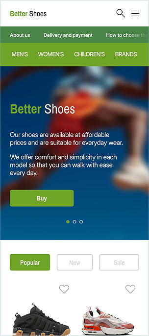
“Better shoes” - Shoe Shop
Our shoes are available at affordable prices and are suitable for everyday wear. We offer comfort and simplicity in each model so that you can walk with ease every day.
[ A ]
[ 1 / 3 ]
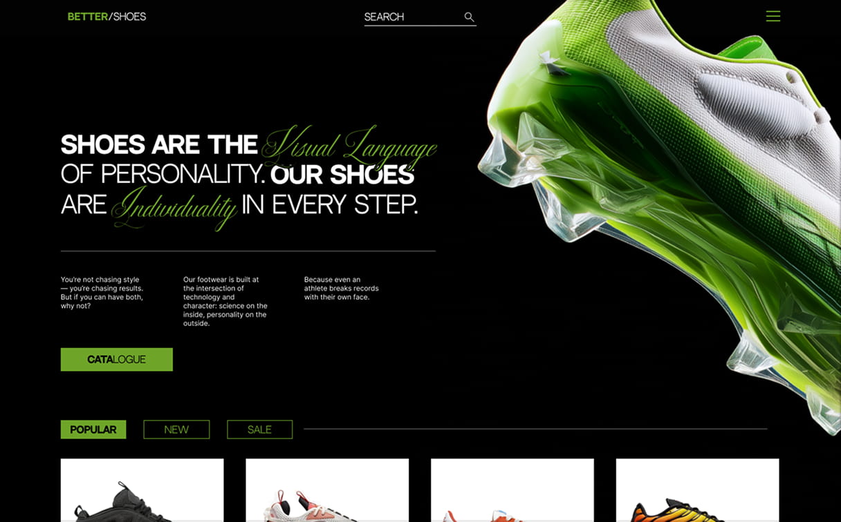
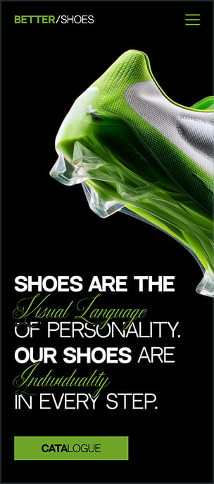
Shoes are the visual language of personality. The model, colour, shape — all of this speaks more about a person than it might seem. Our shoes are individuality in every step.
[ B ]
[ 1 / 3 ]
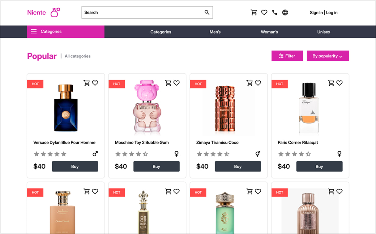
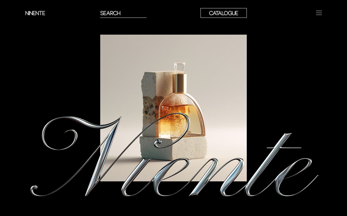
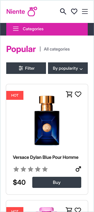
“Neitne” - Perfume Shop
We offer fragrances for everyone, whether light and fresh or rich and warm. They are easy to apply and last long, while the price is accessible for all.
[ A ]
[ 2 / 3 ]
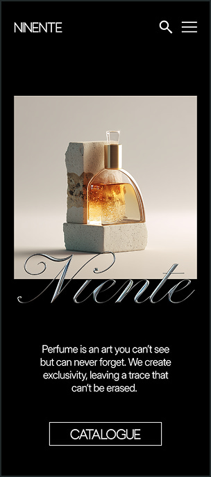
Perfume is an art you can’t see but can never forget. We create exclusivity, leaving a trace that can’t be erased.
[ B ]
[ 2 / 3 ]
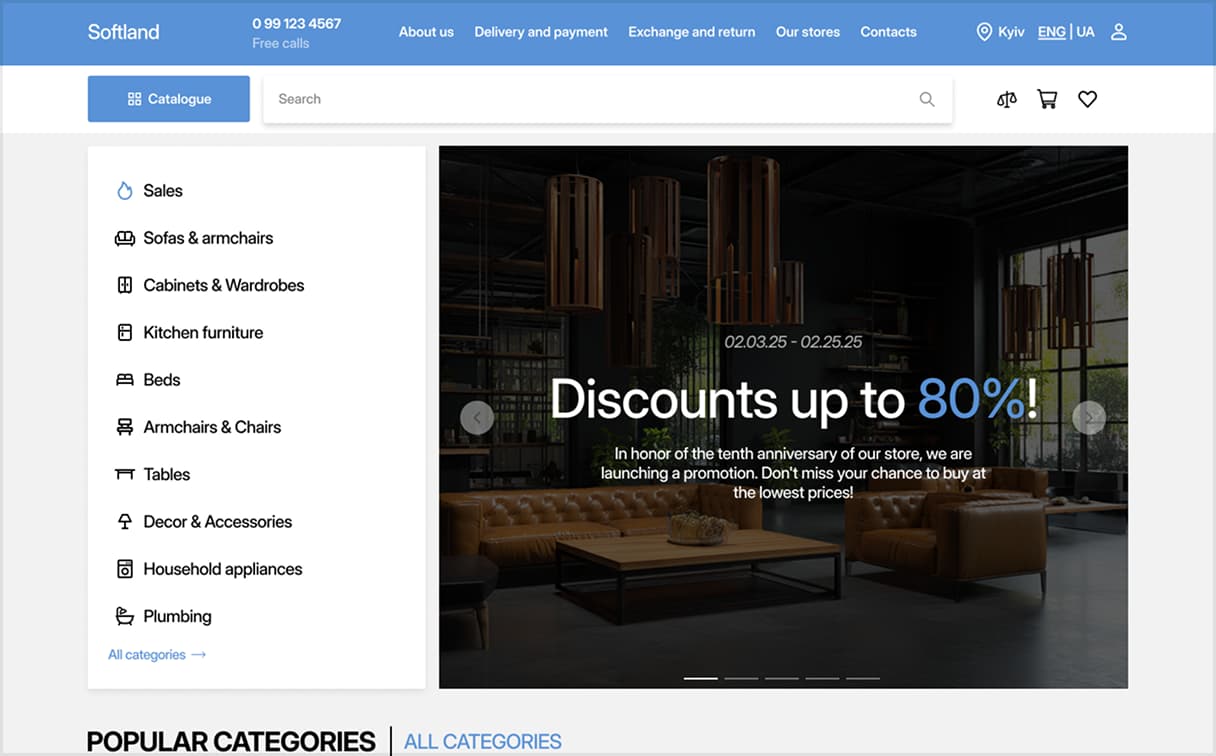
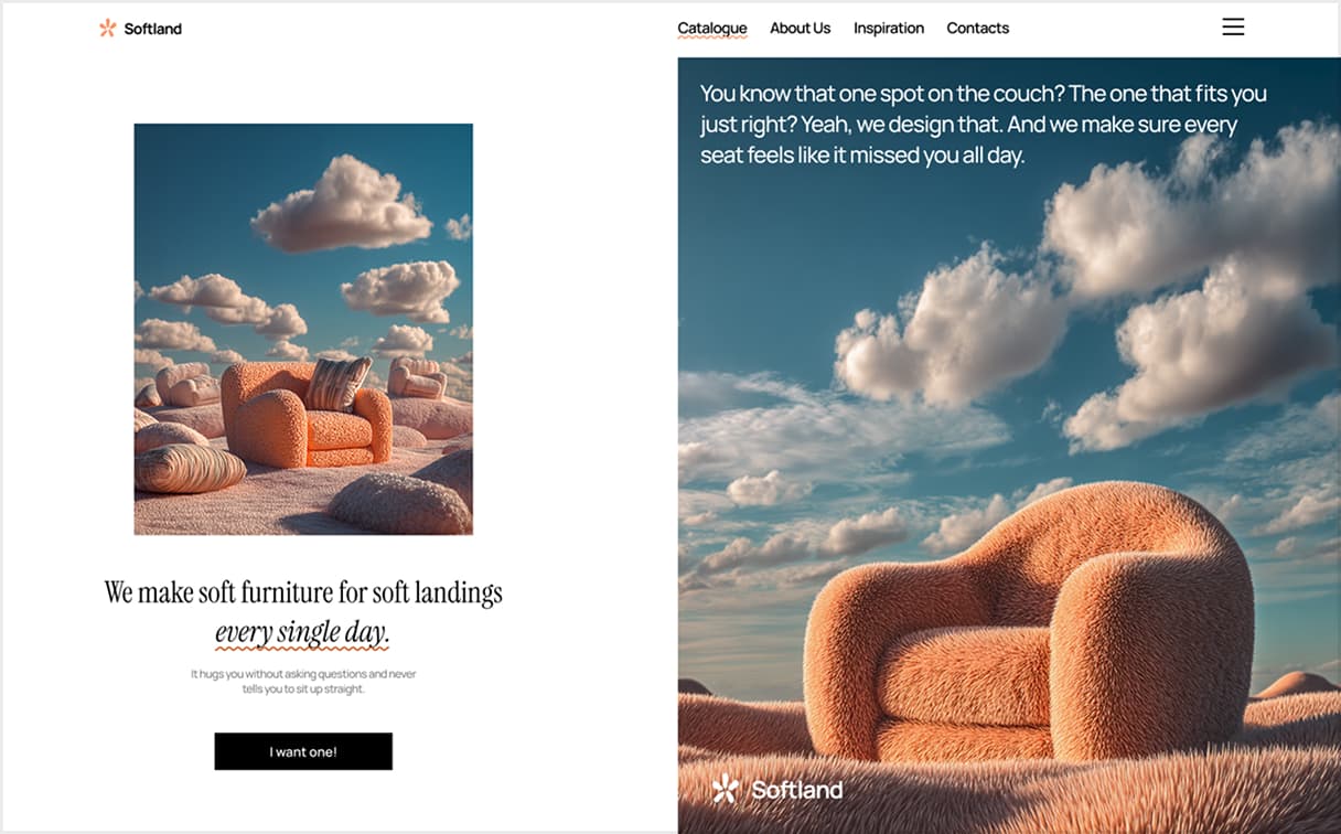
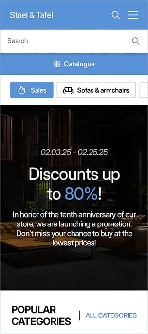
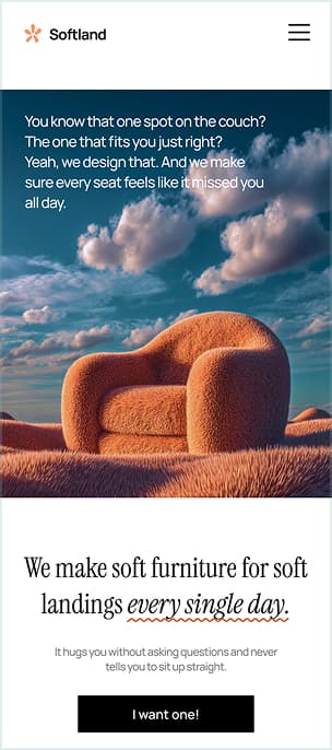
“Softland” - Furniture Store
Here, you’ll find a wide selection of furniture for every taste. Beds, sofas, wardrobes, and tables — all at affordable prices. Convenient delivery and various payment options.
[ A ]
[ 3 / 3 ]
Home begins with emptiness. Then, a table appears, where people gather. A chair you sit in with a cup of coffee. We don’t just sell furniture — we give form to your habits, in which it’s cozy to be yourself.
[ B ]
[ 3 / 3 ]
The difference is huge, isn’t it?
Please note that none of the options violate the design rules: contrast, spacing between elements, typography - I deliberately did not violate them in the options on the left, so that you could better see the difference between the variants.
Because it's not about the design rules, it's about the idea.
This is the magic I create — bringing brands to life and refreshing them. At first glance, it may seem simple, but in reality, developing the right concept is a huge task that designers work on for years.
Audience analysis, market comparison, surveys, statistical data, scientific articles — these are the main pillars of my professionalism. Because a good designer doesn’t just draw, they develop.
Let me demonstrate more clearly.
What do you think, which option looks better?
“Better shoes” - Shoe Shop
Our shoes are available at affordable prices and are suitable for everyday wear. We offer comfort and simplicity in each model so that you can walk with ease every day.
[ A ]
[ 1 / 3 ]
Shoes are the visual language of personality. The model, colour, shape — all of this speaks more about a person than it might seem. Our shoes are individuality in every step.
[ B ]
[ 1 / 3 ]
“Neitne” - Perfume Shop
We offer fragrances for everyone, whether light and fresh or rich and warm. They are easy to apply and last long, while the price is accessible for all.
[ A ]
[ 2 / 3 ]
Perfume is an art you can’t see but can never forget. We create exclusivity, leaving a trace that can’t be erased.
[ B ]
[ 2 / 3 ]
“Softland” - Furniture Store
Here, you’ll find a wide selection of furniture for every taste. Beds, sofas, wardrobes, and tables — all at affordable prices. Convenient delivery and various payment options.
[ A ]
[ 3 / 3 ]
Home begins with emptiness. Then, a table appears, where people gather. A chair you sit in with a cup of coffee. We don’t just sell furniture — we give form to your habits, in which it’s cozy to be yourself.
[ B ]
[ 3 / 3 ]
The difference is huge, isn’t it?
Please note that none of the options violate the design rules: contrast, spacing between elements, typography - I deliberately did not violate them in the options on the left, so that you could better see the difference between the variants.
Because it's not about the design rules, it's about the idea.
This is the magic I create — bringing brands to life and refreshing them.
At first glance, it may seem simple, but in reality, developing the right concept is a huge task that designers work on for years.
Audience analysis, market comparison, surveys, statistical data, scientific articles — these are the main pillars of my professionalism. Because a good designer doesn’t just draw, they develop.
Let me demonstrate more clearly.
What do you think, which option looks better?
“Better shoes” - Shoe Shop
Our shoes are available at affordable prices and are suitable for everyday wear. We offer comfort and simplicity in each model so that you can walk with ease every day.
[ A ]
[ 1 / 3 ]
Shoes are the visual language of personality. The model, colour, shape — all of this speaks more about a person than it might seem. Our shoes are individuality in every step.
[ B ]
[ 1 / 3 ]
“Neitne” - Perfume Shop
We offer fragrances for everyone, whether light and fresh or rich and warm. They are easy to apply and last long, while the price is accessible for all.
[ A ]
[ 2 / 3 ]
Perfume is an art you can’t see but can never forget. We create exclusivity, leaving a trace that can’t be erased.
[ B ]
[ 2 / 3 ]
“Softland” - Furniture Store
Here, you’ll find a wide selection of furniture for every taste. Beds, sofas, wardrobes, and tables — all at affordable prices. Convenient delivery and various payment options.
[ A ]
[ 3 / 3 ]
Home begins with emptiness. Then, a table appears, where people gather. A chair you sit in with a cup of coffee. We don’t just sell furniture — we give form to your habits, in which it’s cozy to be yourself.
[ B ]
[ 3 / 3 ]
The difference is huge, isn’t it?
Please note that none of the options violate the design rules: contrast, spacing between elements, typography - I deliberately did not violate them in the options on the left, so that you could better see the difference between the variants.
Because it's not about the design rules, it's about the idea.
This is the magic I create — bringing brands to life and refreshing them. At first glance, it may seem simple, but in reality, developing the right concept is a huge task that designers work on for years.
Audience analysis, market comparison, surveys, statistical data, scientific articles — these are the main pillars of my professionalism. Because a good designer doesn’t just draw, they develop.
About my 
In this section, you'll find base pricing for the four main service areas I work in.
Please note that listed prices are approximate and may vary depending on the complexity of the project, number of screens or pages, availability of content, deadlines, and the scope of revisions.
I am also open to other types of work, you can personally clarify whether your task is suitable for my services.

Designing the visual layout of web pages.
Web & UI/UX Design
$300
Minimal cost
Designing visual content to communicate messages.
Graphic Design
$100
Minimal cost
Designing of product packaging.
Product Design
$250
Minimal cost
About my
In this section, you'll find base pricing for the four main service areas I work in.
I am also open to other types of work, you can personally clarify whether your task is suitable for my services.
Please note that listed prices are approximate and may vary depending on the complexity of the project, number of screens or pages, availability of content, deadlines, and the scope of revisions.
Designing the visual layout of web pages.
Web & UI/UX Design
$300
Minimal cost
Designing visual content to communicate messages.
Graphic Design
$100
Minimal cost
Designing of product packaging.
Product Design
$250
Minimal cost
Designing the visual layout of mobile apps.
Mobile App Design
$200
Minimal cost

And last but not least,
My 
About the project
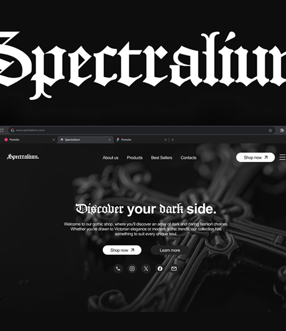
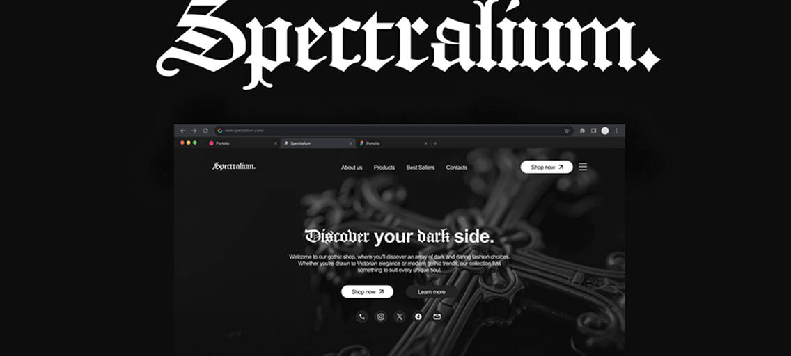
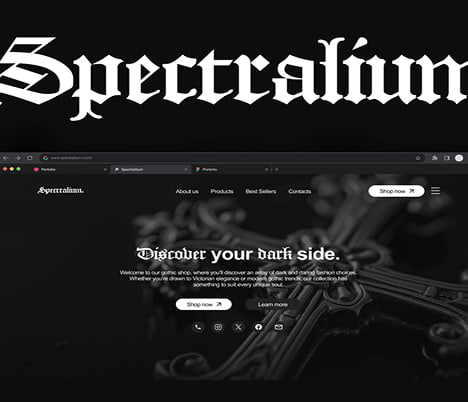
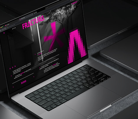
Landing page of "Spectralium." is designed in a gothic style with an emphasis on dark colors and unique decorative elements in the form of crosses. The visual solutions emphasize the dark aesthetics of the store.
And last but not least,
My
About the project
Landing page of "Spectralium." is designed in a gothic style with an emphasis on dark colors and unique decorative elements in the form of crosses. The visual solutions emphasize the dark aesthetics of the store.
About the project
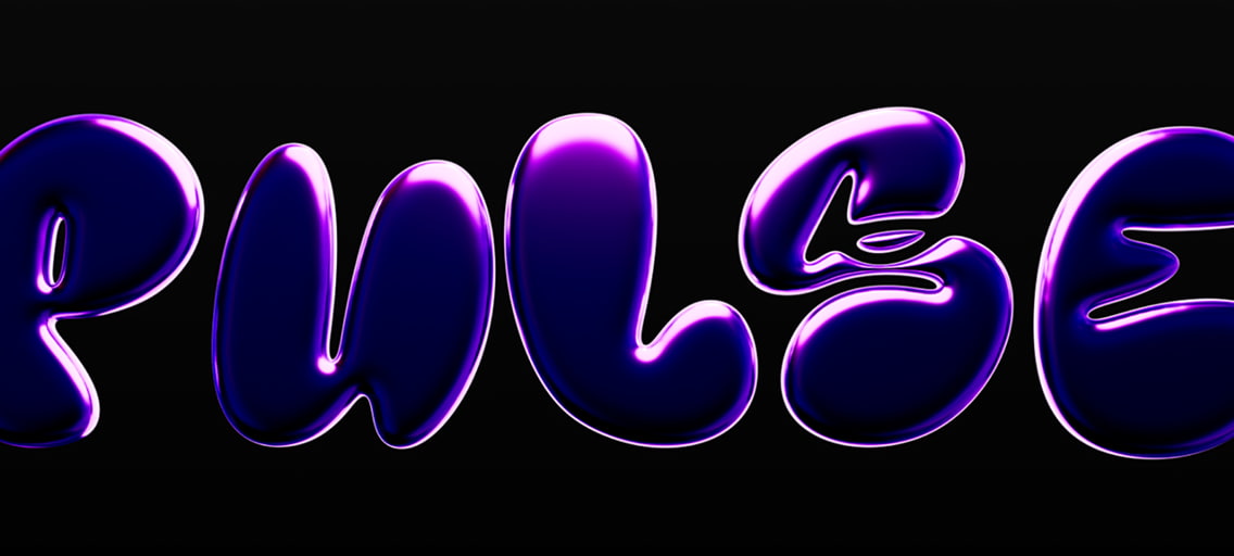
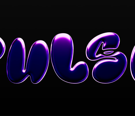
The Pulse project is a web design for a nightclub with a focus on creating a striking visual accent. The centerpiece of the site is a large 3D text "Pulse" in a puffy, purple style.
About the project
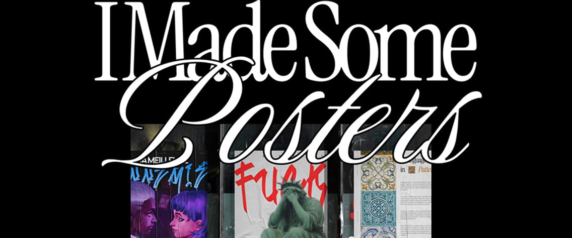
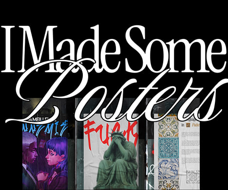
A modern and expressive poster series designed to capture attention and communicate key messages with clarity. The set features six unique visuals, each with its own distinct concept, yet unified through a cohesive visual language.
About the project
Plymax is a modern furniture and design company specializing in creating high-quality, functional and stylish furniture for homes, offices and hotel spaces.
About the project
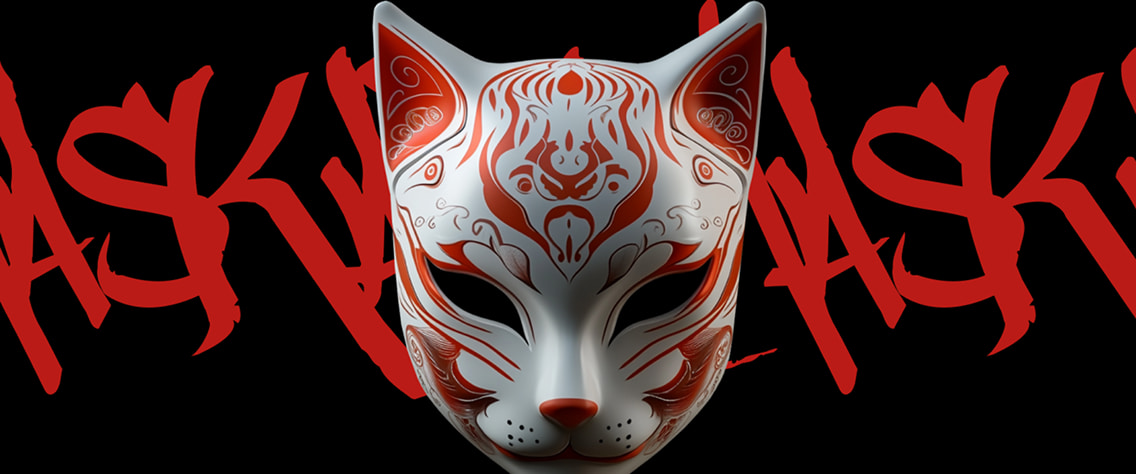
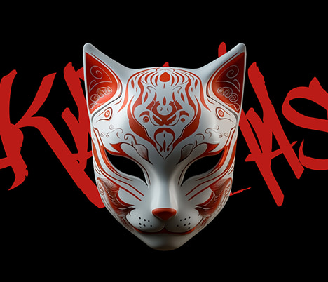
Maskara is a web project that explores the mysterious world of handcrafted masks inspired by folklore and mythology. The site offers custom designs and virtual try-ons, allowing users to immerse themselves in the enigmatic art of mask-wearing.
About the project
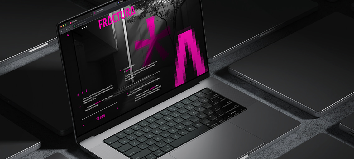
Project about a reaction. To the grid. To uniformity. To the algorithmic smoothness of modern visuals. Everywhere we looked, we saw repetition disguised as clarity, perfection mistaken for elegance.
About the project
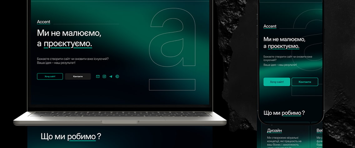
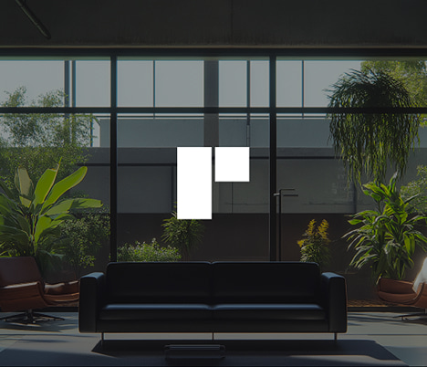
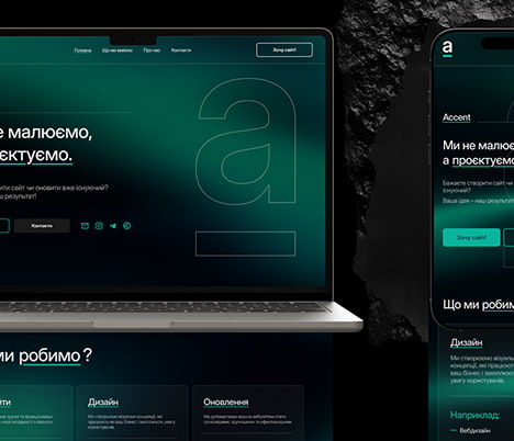
A modern and functional website for IT company, emphasizing clear navigation, a strong visual identity, and an organized portfolio showcase. The design balances aesthetics and usability, ensuring a seamless user experience across all devices.
About the project
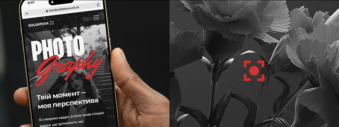
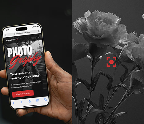
Soldatova — is a personal branding website concept for a photographer from Odesa, Ukraine. The main goal of the project was to reflect the author’s identity through visual design — emotional, bold, confident, and stylish.
About the project
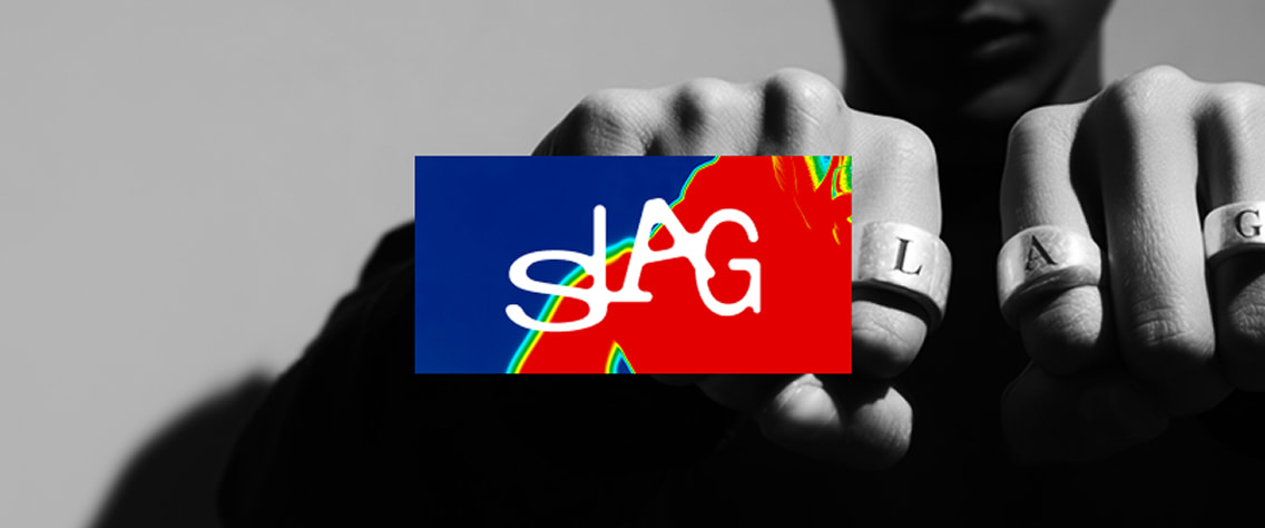
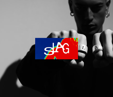
SLAG is a Norway-based studio working at the intersection of jewelry, typography, and sculpture. Their debut collection explores rings as building blocks of language — each one shaped as a letter, each one worn to create a message.
And last but not least,
My
About the project
Landing page of "Spectralium." is designed in a gothic style with an emphasis on dark colors and unique decorative elements in the form of crosses. The visual solutions emphasize the dark aesthetics of the store.
About the project
The Pulse project is a web design for a nightclub with a focus on creating a striking visual accent. The centerpiece of the site is a large 3D text "Pulse" in a puffy, purple style.
About the project
A modern and expressive poster series designed to capture attention and communicate key messages with clarity. The set features six unique visuals, each with its own distinct concept, yet unified through a cohesive visual language.
About the project
Plymax is a modern furniture and design company specializing in creating high-quality, functional and stylish furniture for homes, offices and hotel spaces.
About the project
Maskara is a web project that explores the mysterious world of handcrafted masks inspired by folklore and mythology. The site offers custom designs and virtual try-ons, allowing users to immerse themselves in the enigmatic art of mask-wearing.
About the project
Project about a reaction. To the grid. To uniformity. To the algorithmic smoothness of modern visuals. Everywhere we looked, we saw repetition disguised as clarity, perfection mistaken for elegance.
About the project
A modern and functional website for IT company, emphasizing clear navigation, a strong visual identity, and an organized portfolio showcase. The design balances aesthetics and usability, ensuring a seamless user experience across all devices.
About the project
Soldatova — is a personal branding website concept for a photographer from Odesa, Ukraine. The main goal of the project was to reflect the author’s identity through visual design — emotional, bold, confident, and stylish.
About the project
SLAG is a Norway-based studio working at the intersection of jewelry, typography, and sculpture. Their debut collection explores rings as building blocks of language — each one shaped as a letter, each one worn to create a message.
My 
Too lazy to contact me yourself? Checked out the portfolio and decided to browse the site again? No problem — here’s your desired “Contact Me” button. Feel free to reach out :)


My
Too lazy to contact me yourself? Checked out the portfolio and decided to browse the site again? No problem — here’s your desired “Contact Me” button. Feel free to reach out :)
My
Too lazy to contact me yourself? Checked out the portfolio and decided to browse the site again? No problem — here’s your desired “Contact Me” button. Feel free to reach out :)

©
©
©